CLO!
Visual Identity Design
Client: Clo!
Year: 2022

Visual Identity Design
Client: Clo!
Year: 2022
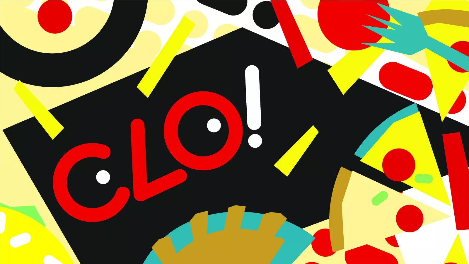
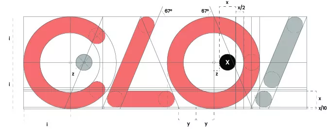
CLO! is much more than a family restaurant. It is an experience designed to surprise. With that in mind, we built a typographic brand with a strong personality: the dots are not a decorative detail, they are the gesture that transforms a word into an image. A visual wink, a subtle act of mischief in the logo that anticipates what guests will experience inside the restaurant.
CLO! delivers a creative, fresh, and unexpected experience. It breaks away from the obvious without losing warmth. It’s that subtle sense of transgression that transforms a simple family outing into something distinctive, memorable, and full of personality.


CLO!’s visual identity expands on the logo concept and turns it into an immersive experience. Illustrations of pop culture icons take over the space through a simple yet powerful gesture: the brand replaces their eyes. The result is provocative, playful, and instantly recognizable.
More than 40 framed pieces placed throughout the venue invite guests to play, observe, and discover. It’s not just about going out to eat; it’s about identifying characters, sharing knowing glances at the table, and looking again to spot something new.
While flavor is the true protagonist at CLO!, the visual experience transforms the restaurant into something different and elevates the brand beyond just a good culinary memory.
We developed an extensive system of illustrations and patterns, built under clear usage guidelines that ensure consistency and visual impact. A distinctive graphic language designed to be instantly recognizable.
The aesthetic is bold and memorable, yet playful and energetic. It vibrates. It captures attention. It consistently supports what the space stands for, inviting guests to relive the experience long after they leave the restaurant.