
PiaLaLa is a family-run venture born from the perfect blend of craft and curiosity. On one hand, there’s the sewing expertise of its founder; on the other, a constant drive to experiment and shape objects that are useful, functional, and—above all—beautiful.
Its tagline, “Hacemos cosas lindas” (“We Make Beautiful Things”), is more than just a slogan: PiaLaLa aims to create products so appealing that they become the perfect choice when giving a special gift.
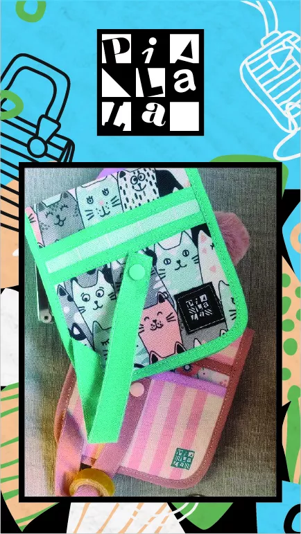
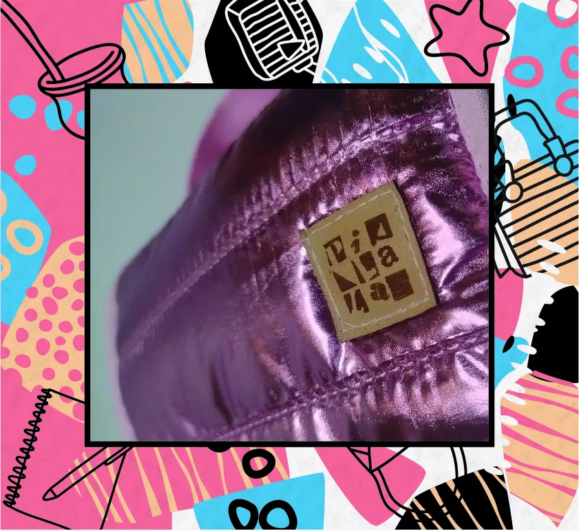
With the goal of strengthening its identity and building a coherent brand communication, PiaLaLa entrusted us with the complete development of its brand and branding system. The challenge was to create a mark that could be easily applied at small sizes, strong enough to stand out among visually rich textures and patterns, reproducible across different materials without losing quality, and at the same time, reflect the relaxed, eye-catching, and slightly unconventional spirit that defines both the brand and its products.
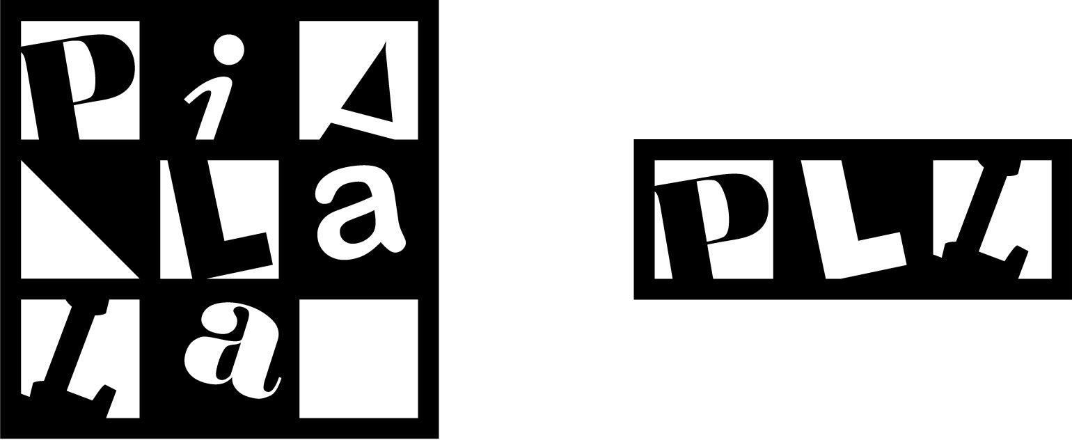
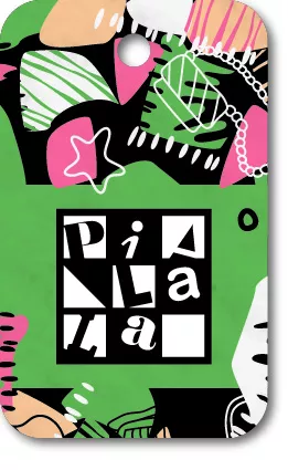
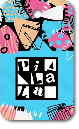
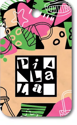
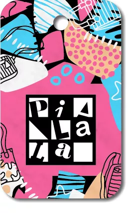
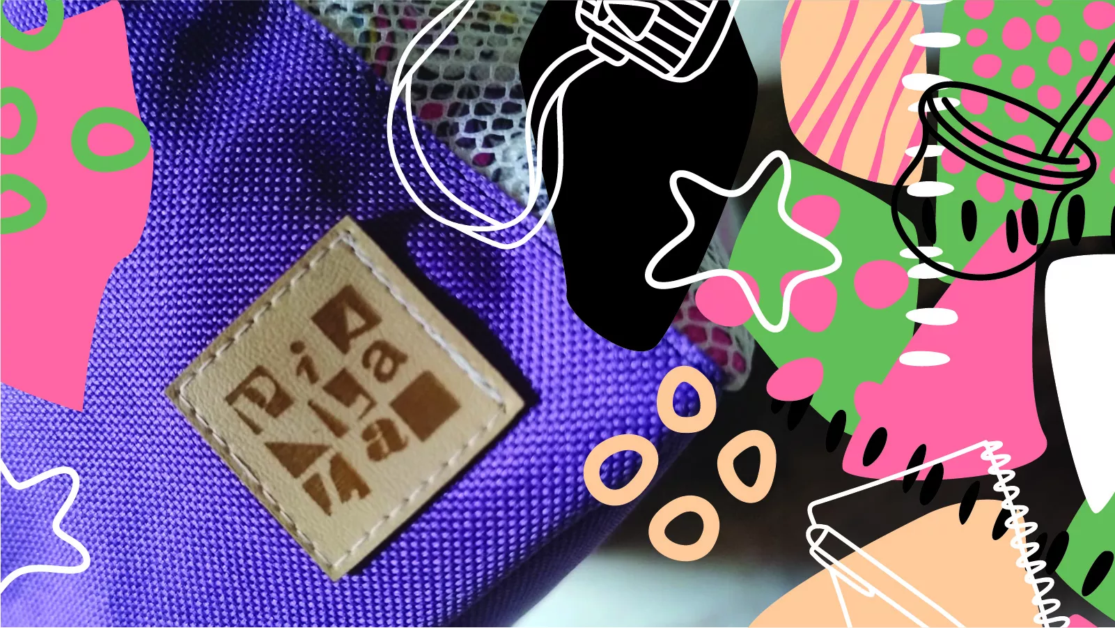
The result is a striking, high-contrast, and playful visual identity, designed to stand out across a wide range of media and coexist with complex images without losing its presence. Additionally, a simplified version was developed that preserves the spirit of the original brand and allows for proper application on smaller-scale products, ensuring consistency, recognition, and character at every touchpoint.
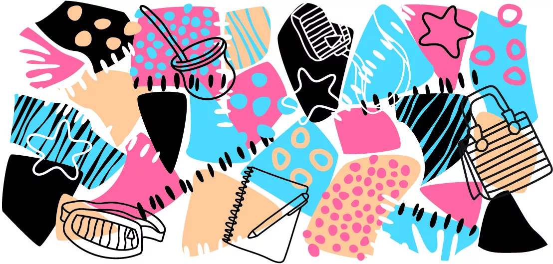
For the development of the branding system, a texture composed of irregular shapes and a vibrant color palette was created, building a bold, cheerful, and expressive image. This element reinforces the playful character of the brand, while the logo, with its more geometric lines, stands out through formal and chromatic contrast, ensuring strong presence and clear readability even in visually dense contexts.
As a complement, simple, gestural illustrations were added to represent objects associated both with PiaLaLa’s products and their various uses. Bags, backpacks, mate cups, pens, and books appear as everyday elements that directly engage with iconic brand items—such as mate sets, pencil cases, and backpacks—expanding the visual universe and strengthening the connection to the daily life of the people who use them.

Regarding color, a flexible system was defined, composed of four primary hues designed to be applied within the pattern. Each combination prioritizes the use of two dominant colors, leaving one in the background, allowing the visual identity to adapt to the multiple color ranges used in the fabrics of the products without losing coherence or brand recognition.
PiaLaLa has grown tremendously since its beginnings, and at Broom we are excited to have supported this journey, providing a solid, versatile, and characterful visual identity—one capable of growing alongside the brand and accompanying its next steps.
